


Project Overview
Established in 2018, NEX Foundation is a Seattle-based nonprofit startup, aims to connect global Taiwanese talents together. In this project, we aimed to create a new brand guideline that brings NEX’s value to our users.
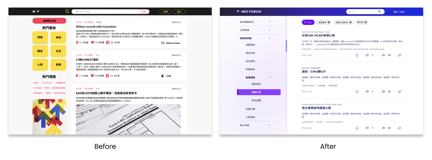
I was part of the NEX design team working with engineers, PMs to develop a forum product for all Taiwanese students to connect. After completing this brand design, we started applying this guideline to the Forum product. View here.
My Responsibilities
Date - December 2021 – September 2021 (6 months)
Team - Designers, Engineers, Project manager
Role - Visual Design Lead, User Research
Challenges
How might we create a visual that resonate to the brand’s value?
After 2 years of the effort, NEX now had 50+ employees, 2 products and more than 4,000 users globally. However, there was no design system to align all of our programs together and help the users to distinguish NEX from other competitors.
Discover
Logo redesign needs
The logo was having the following issues that makes this logo hard to apply to different materials: scalability, simplicity, accessibility, versatility.
Inconsistent brand identity
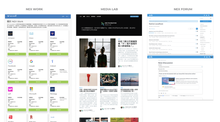
There was no design guideline for the organization at the moment, so each product had it's own design and it leads to incoherent user experience.
Brand Principle
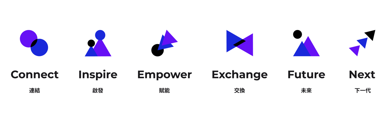
We collected the words from NEX’s marketing and branding materials in a total of 80 words. After making sure every text is aligned with our branding value, we started to re-grouped and finalized the words into 5 principles that best represents NEX foundation.
Ideation
Persona
Users need more info when they are making big decisions. Therefore, we focused on the “decide field”, “application prep” and “decide offer” phases.
During these time, the applicants need to look at many materials in order to make important decisions on selecting schools/ cities / lifestyle…etc.

Competitive Analysis
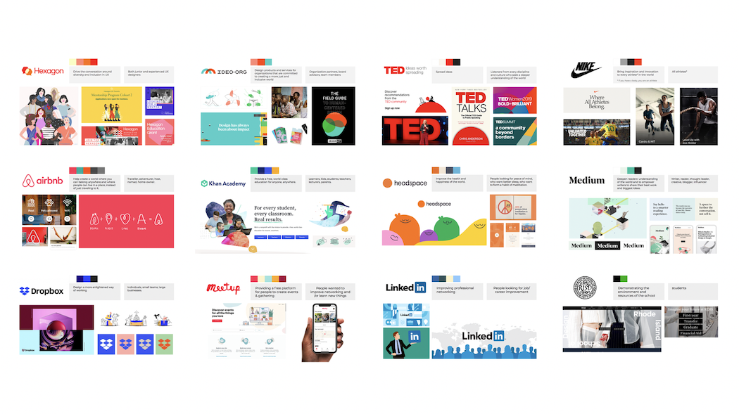
We conduct a competitive analysis to explore potential identities that will fit our brand value to develop our visual identity.
Mood Board
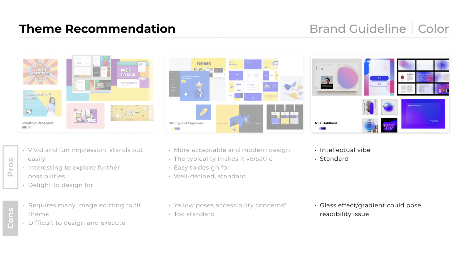
We presented our boards to the leadership and teams, and the boards Boldness, got the most votes because it matches our branding principle the most.
It was also two of my favorite because the color combinations are powerful, and truly reflect our brand. After some sketches and brainstorming,
our designer team decided to start with four colors inspired by the boards.
Design Solutions
Typography
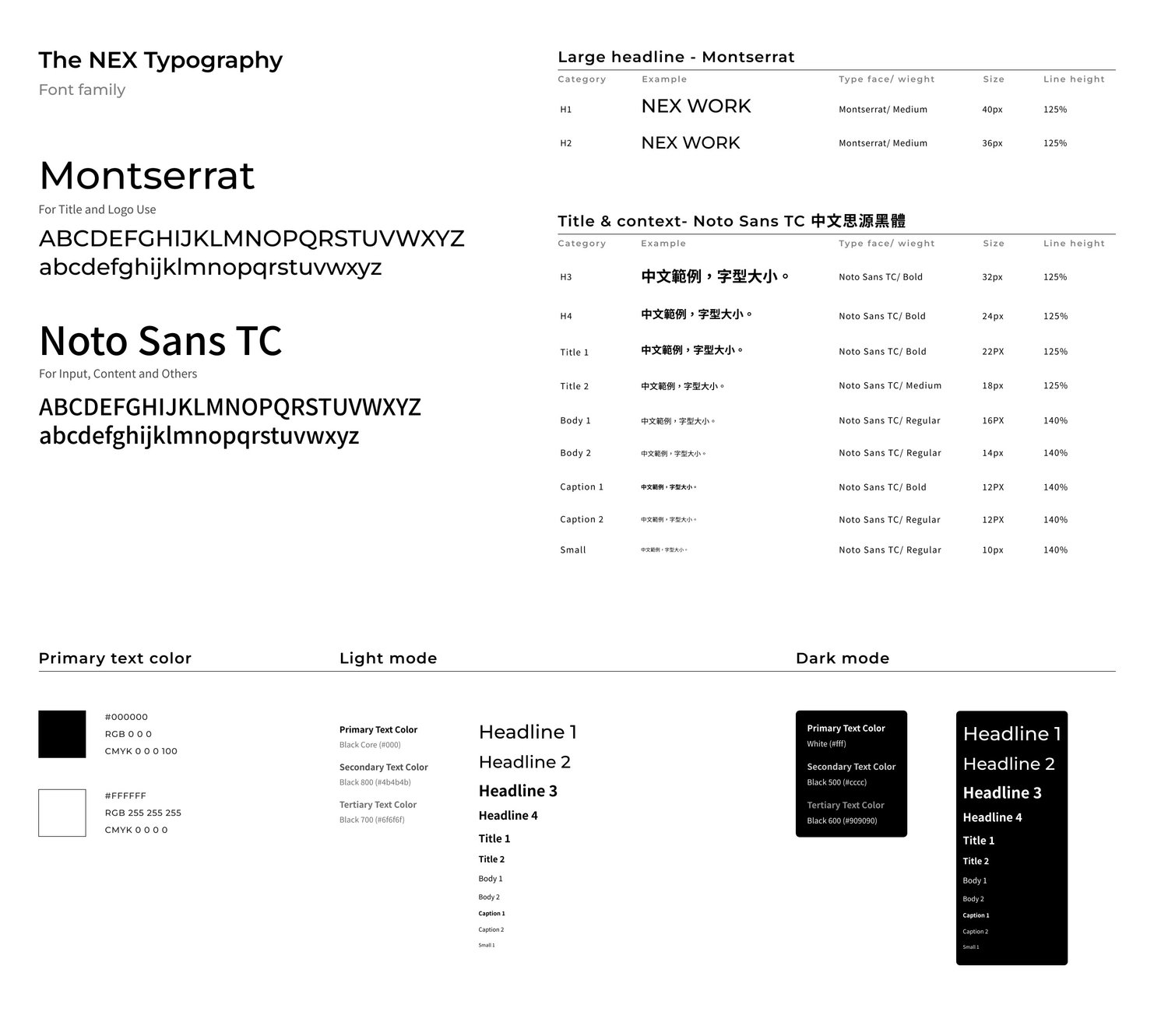
Due to the unique user needs of NEX's product, the proportion of the Chinese to English characters are used 76% to 24%. Therefore,
the consistant look of English and Chinese is important. The organization had used Montserrat for years, and they want to keep using it for easier maintanance.
Brand Identity
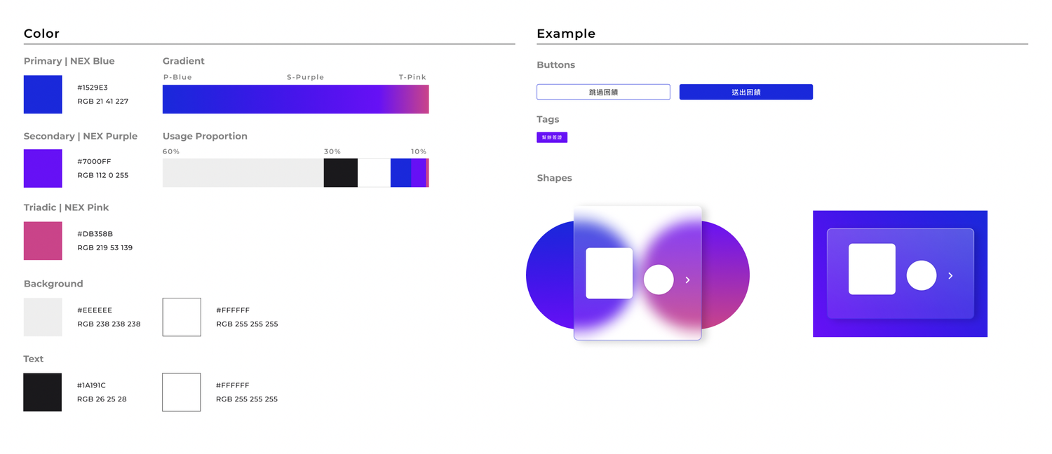
After reviewing the color, printability, and usage, we presented Option 3 to the leadership after a month of studying. We brought in the yellow color from the
Option 1 to create the dynamic sense to the option 2. The magenta help shaping the NEX’s unique style and pop out from our other competitors.
Logo Design
The new NEX symbol is a composition of two triangles representing the main capital alphabets “N”&” X” of our brand’s name.
The connected triangle patterns indicate the growing mountain and symbolise the solid connection that presents our experience principle well.
Brand Identity
After proposing to the leadership and project team lead, we made a decision on our final logo and logo family.
Brand Identity
After proposing to the leadership and project team lead, we made a decision on our final logo and logo family.
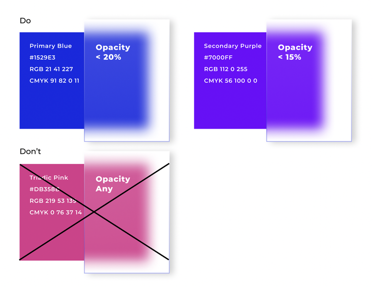
Brand Color
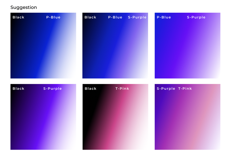
As gradient + glassmorphism plays an essential role in the visual identity, to maintain great visual accessibility,
we developed strict design guidelines based on much testing.
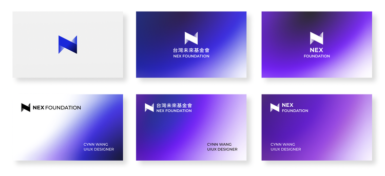
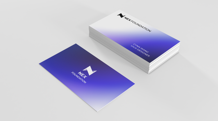
Usage Example
Vignette

Results
“The design guideline feels young and vibrant. We really like it!”
We presented the final design to the teams via Google meeting with 30+ people attended. The teams and leadership agreed and confirmed that this can represent our brand.
Takeaway
Versatility is the key
The chosen colors needed to be flexible to use digitally and on the print copy. Therefore, there are many things to be considered when we make the design decision.
Back to Projects