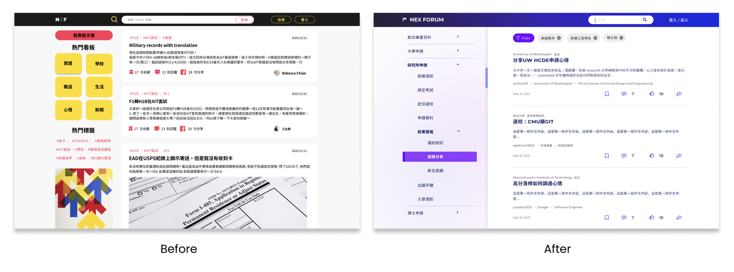
Project Overview
There are about 23,724 Taiwanese students enrolled at US institutions each year according to AIT, yet there is not a proper platform for them. Taiwanese students spread around on different web platforms from other nations, but situations are different from country to country because of Visa, policies and languages.
I was part of the NEX design team working with engineers, PMs to develop a forum product for all Taiwanese students to connect.
My Responsibilities
Date - March 2021 – September 2021 (6 months)
Team - Designers, Engineers, Project manager
Role - Product Design, Visual Design, User Research
Challenges
What if there is a platform that can help the users get referable, updated, filtered, and tailored information in Chinese so they can quickly find the one they need?
My role as an UX designer in the project team was to improve user experience of this new product released in March 2021. At the time, the forum was built without any research or strategy. Thus, we decided to conduct a user research to find out the opportunity for NEX Forum.

Research Methods
Literature review
We reviewed the statics from AIT and Ministry of Foreign Affairs for infomation about Taiwanese students’ age, gender, educational status when they study abroad.
From our own experience and some articles, we found that most of the students considered “application” to be
the most frustrated in the entire studying abroad experience. Therefore, we decided to focus on helping users improving their applying experience.
Qualitative Interviews
we started our interviews with the following qualifications:
1. Just finished application process (2021 enrolling students)
2. US school students
3. Majored in CS, business school, engineering, applied and pure science, health and science, art & design students
We were able to conduct 6 online interviews with the 2021 enrolling Taiwanese students to know about our TA. We recorded our meetings and listed out all the findings.
Research Findings
1. Applicants need customized info tailored for their capabilities and needs.
2. Applicants prefer talking to people from target school or similar backgrounds.
3. Application process has patterns.
4. The newer information is better and more referable.
5. The selection of school or program is a chore. (e.g. ranking, program suitability, tuition, scholarship, location).
6. Applicants focus a lot on future career in the US.
Ideation
User Journey
Users need more info when they are making big decisions. Therefore, we focused on the “decide field”, “application prep” and “decide offer” phases.
During these time, the applicants need to look at many materials in order to make important decisions on selecting schools/ cities / lifestyle…etc.

User Persona
Information that is filtered, updated, and written in Chinese from someone shareed similar educational background is the most valueable for the Taiwanese students.

Opportunities
We came up with 50+ ideas on how we can help users to get the right info with a platform product. We then review and grouped the ideas to be “Future/mentorship program ideas” , “Dream idea” , “Existed”, “Need further exploration”, “Doable”. We collected the doable ideas and specified the MVP and listed out the schedule and goals.
Category / filtering system
1. Timeline/process generated most needed information.
2. Larger to smaller scale schedule that can have systematic information.
3. Searching engine that comes with a very specific filtering system.
4. Career-oriented categorizing and filtering
Quick skim
1. Various templates for experience sharing posts
2. Vote/toll feature to help making decision
3. Specific “Ask XXX question” tags for other users who may have same questions.
Forum grow with the users / tailor for the users
1. change tags, feed and posts based on user’s current status
2. Update user’s recent status based on the timeline.
3. Quiz to generate customized tags
4. Highlight user’s posts who has more credit
Networking
1. weekly/monthly online gathering to share life experience in the states
2. Highlight info provided from known network
3. Taiwanese School-based networking meetup (online/offline)
4. Linkedin/network for specific school/program questions
Design Iterations
Start with Post Details
All of the interviewees used Google to search for the information they may need, whether its schools, rankings, local life, tuitions, graduation
requirements or scholarships. Therefore, we decided to start our design iteration from google instead of our homepage. Also, they uses both laptop and
desktop devices equally depended on their conveniences and application process, so we decided to develop both app and desktop versions at the same time.

Design Solutions
Thread Partial View
Information of the posters' most current title and the institutes/organizations they belong in will help inspire and resonate
the users with threads they might potentially be interested in.

Thread Full View
On each post/thread page, users can see the poster's education experience and their most current status. These are the most basic background
information that determines the experience similarity. By clicking on the button, users will be able to see the poster's detail background information.

Results
“With the author's background here, I don't have to check for myself if this piece of information is ever brought up in the thread.”
I tested the design with a couple of participants. The overall feedback was positive with the participants expressed that the design helped them saved a lot of frustration without having to scroll through the thread checking if the poster's background was ever mentioned.
Takeaway
Due to me being the more experienced designer out of the two-people team I am in, I had to take on a leading position. It is a great experience to have the opportunity of collaborating with someone less experienced than I am. Through explaining my decision-making reasoning, the choice behind the methods I adopted, and critiquing both theirs and my work to come up with the best design, I got to re-evaluate my skills and my rationale more than ever, and by doing so, I have become more aware of my strength and weakness.
Back to Projects

