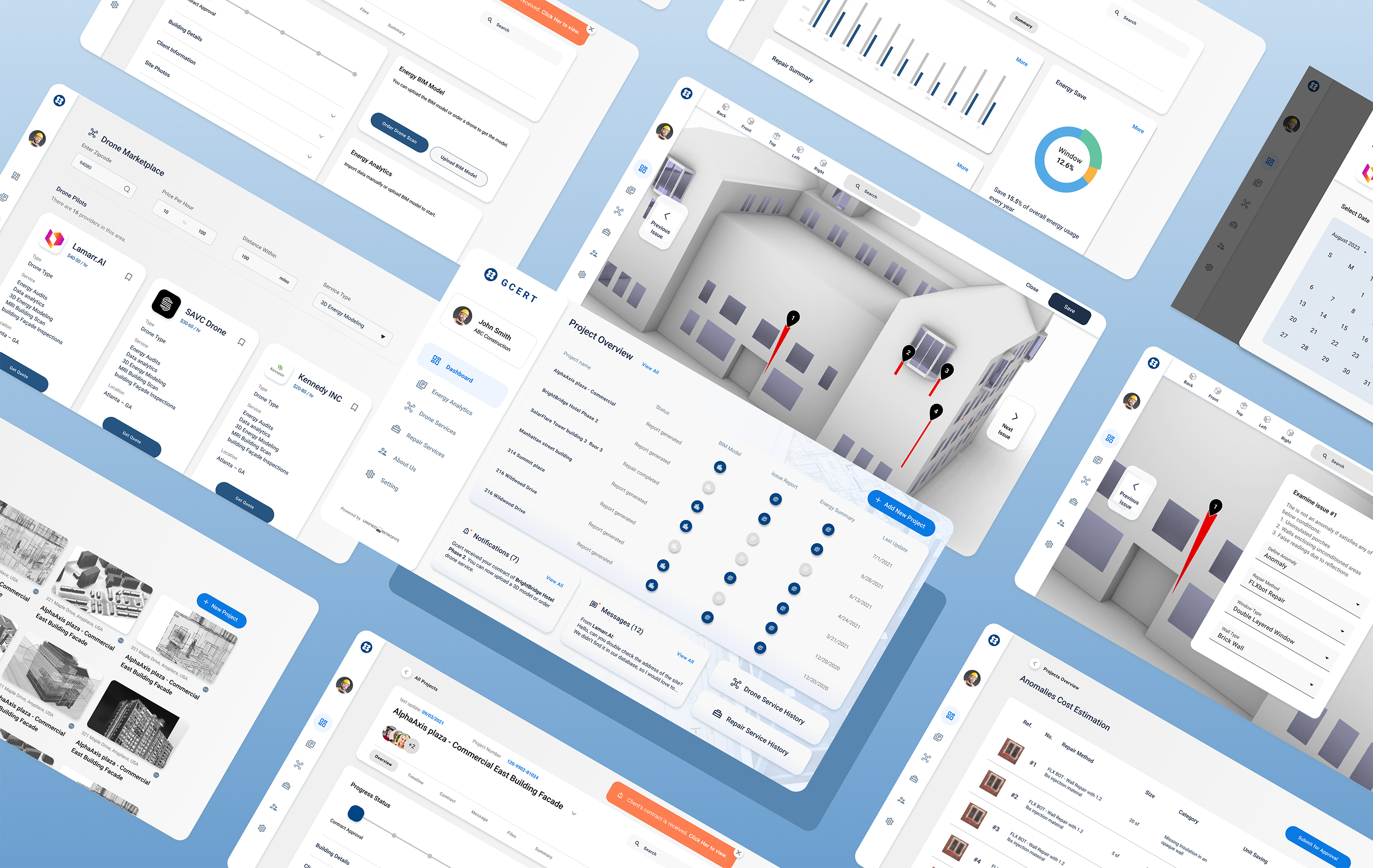
Project Overview
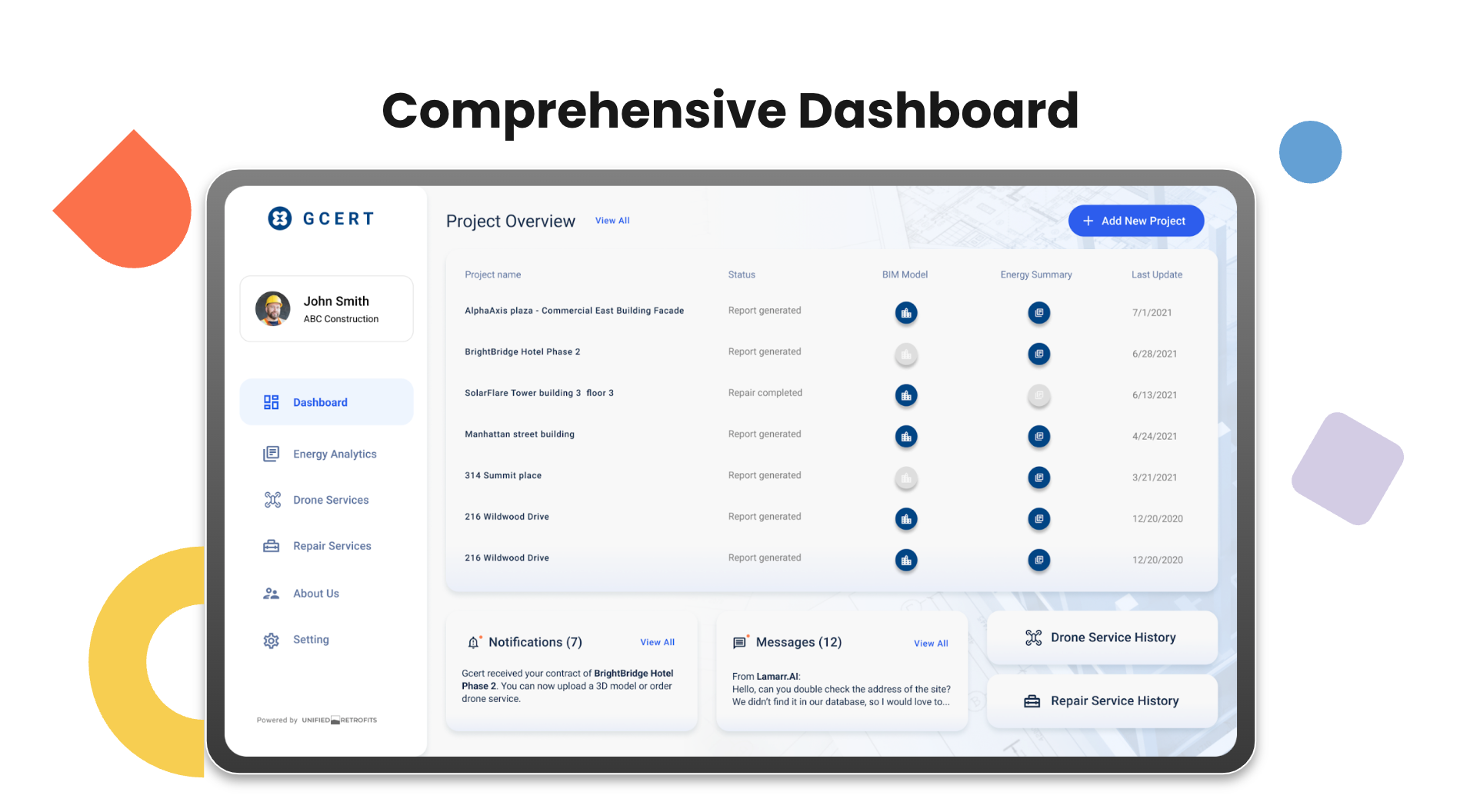
Partnered with Lamarr.AI and FLX Bot, Gensler tried to create a platform that bring all three innovative technologies together for the competition in short amount of time. I joined the project team in the last month before the deadline to quickly put together branding and UX solutions to make the project stunning.
This project focuses on proposing an innovative and intuitive solution for construction industry with the latest technology.
My Responsibilities
Date - March 2022 – April 2022 (1 month)
Team - Designers, Engineers, Project manager, Partners
Role - User Experience Design, Visual Design
Challenges
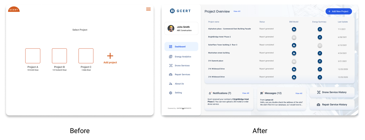
How might we simplify the process of identifying, analyzing, and repairing the energy leaks in the built environment to saving time and resources for construction managers and property owners?
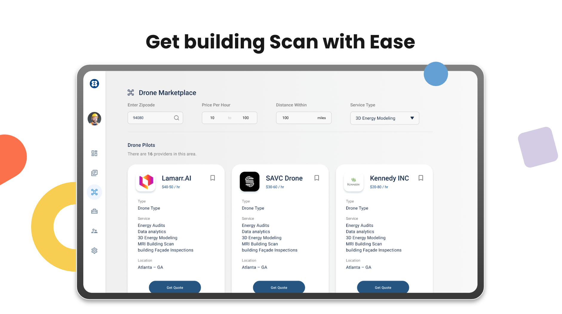
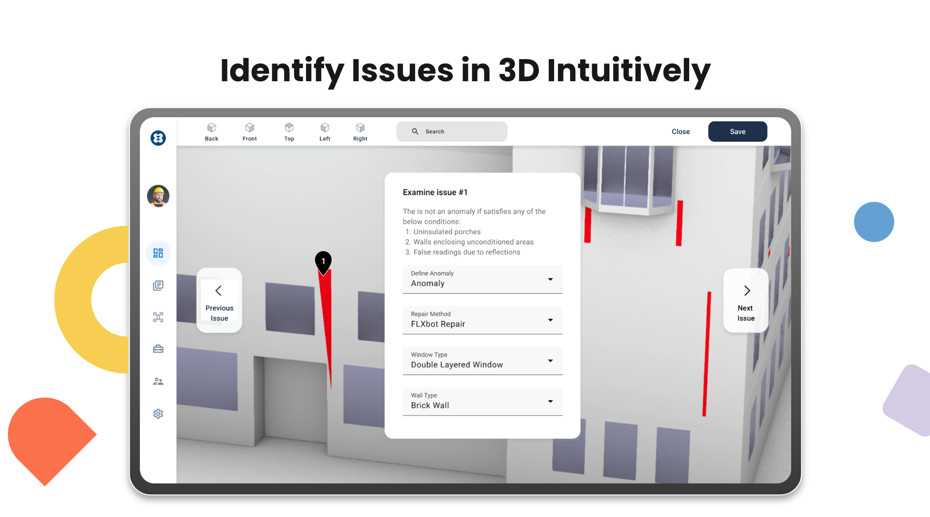
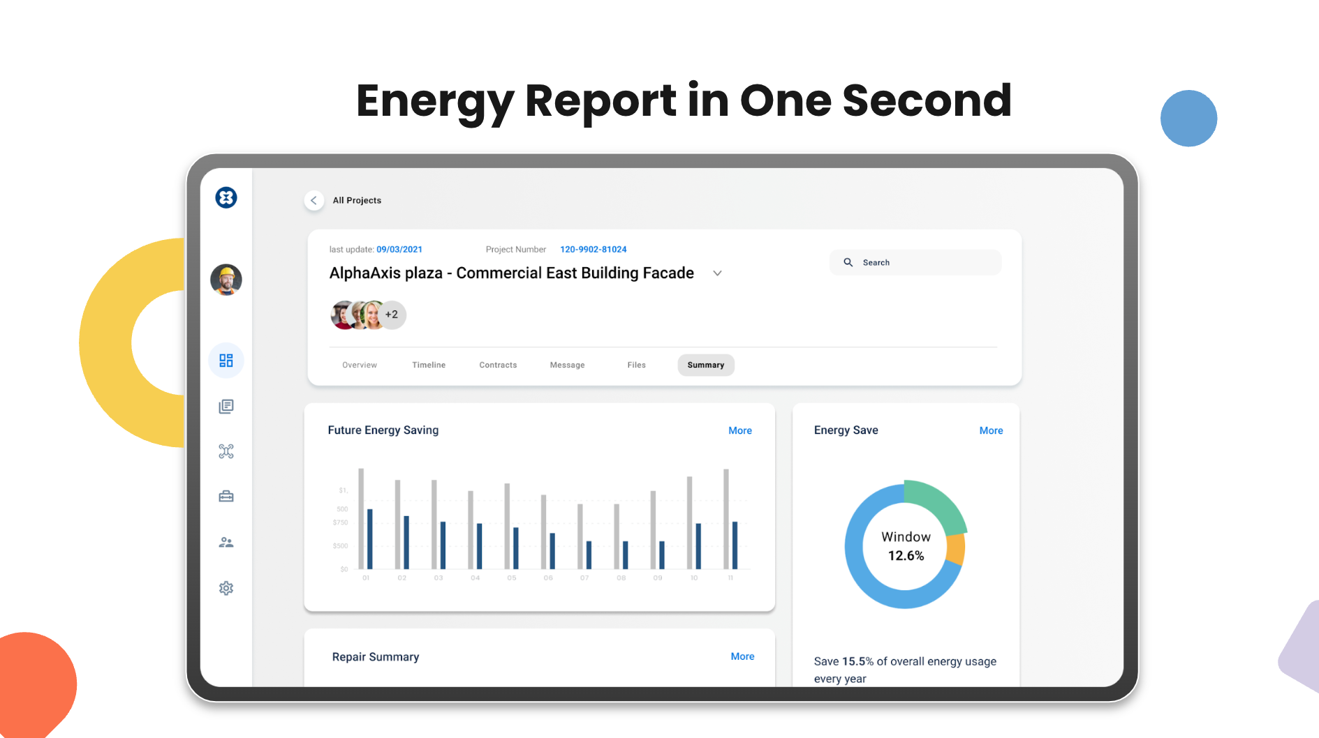
Traditionally, addressing energy leaks has been time-consuming and complex, requiring multiple service providers for different types of leaks. Our platform will enable construction managers to order drone scans and AI analysis to quickly identify the type of energy leak and generate an energy report summary with potential future savings. They can then offer property owners the option of using robot arm repairs to fix the issue, streamlining the repair process and making it more cost-efficient. By integrating all of these services into a single platform, our solution will simplify the process for construction managers and property owners alike.
User Research
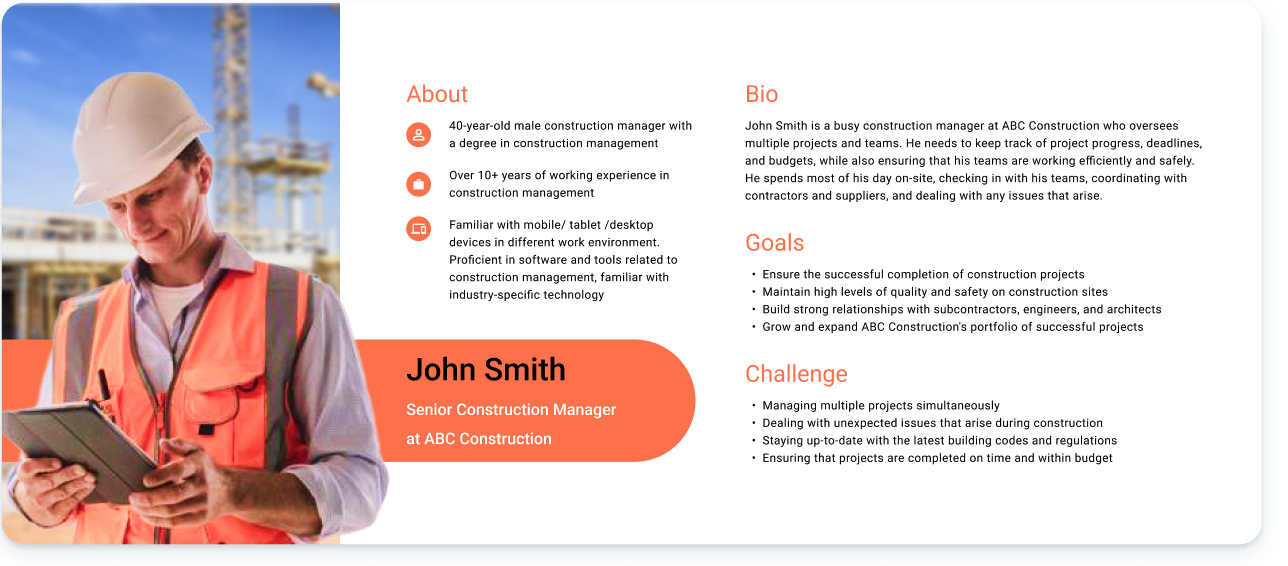
The construction managers work mostly on site, with identifications to be 45 years old male with 68% of them having Bachelor degree.
Given the tight project schedule for the E-robot prize, I quickly researched and gained insights into the target
user group by studying job postings and industry statistics to develop a user persona. With this persona in mind,
our design development has prioritized the key features and optimized the user flow to create a solution that meets
the needs of construction managers in a streamlined and efficient manner.
Key Findings
Upon joining the project team, I reviewed the initial UX flow and conducted a heuristic evaluation with the new user persona
to identify areas for improvement. Based on my analysis, I identified several issues with the current flow, which
needed to be addressed to improve the overall user experience:
Ideation
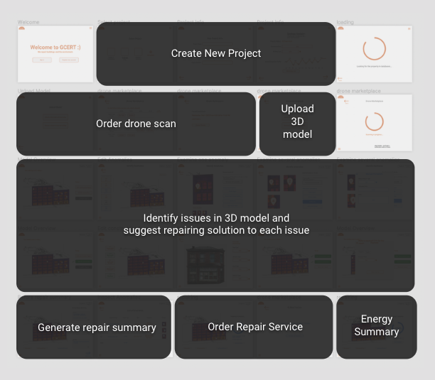
My goal was to simplify the user journey, as the original flow contained over 50 steps that were confusing for both
users and our team. By prioritizing and streamlining the key tasks, I was able to create a clear and efficient user
journey that improved the overall user experience.
During the design process, I was able to persuade the team that our app's unique selling point was not just the 3D model
viewing feature, but rather the ability to offer multiple revolutionary solutions in one platform. As we were participating
in a competition, it was crucial to demonstrate not only the cool and entertaining aspects of the app, but also its
profitability to the judges. Therefore, I focused on highlighting the value proposition of the app, emphasizing its ability
to streamline tasks across multiple industries, and demonstrating its potential to generate revenue. Through this approach,
I was able to showcase the full potential of our app to both potential users and judges alike.
1. Highlight Users
Quick user study to know about the users and their work environment.
2. Simplify feature:
There are many unnecessary features that is not viable or not adding extra complexity for the users.
3. Build Strucure:
Building the information architecture, user journey based on the user persona to build a logical design.
![]()
Design Solutions
Results
“Prototypes developed showcase the promise of advanced robotics to make envelope retrofits more convenient for more people.”
Said Ram Narayanamurthy, a Program Manager in the Building Technologies Office.
We won this competition. We saw the judges keep knoding heads with smile while our presentation, and we knew it's a sucessful and innovative proposal.
During the reviewing session in the competition, all of the judges spent most of the time talking about our product.
I knew that this platform still have a lot of UX problems and technology issues to be solved, but I was proud and grateful of what we can achieve
within very short among of time.
Takeaways
Team alignment is the key
My teammates are all engineers and technologists, so none of them have UX design experience. Initially,
they only wanted me to update the visuals and appearance. However, through quick discovery and the UX process,
I managed to understand the users and convinced the team to embrace a more systematic and logical design approach,
enriched with stunning visuals.
Back to Projects

